If you live in London, or have ever visited it, you have probably used an Oyster Card. Introduced in 2003 by Transport for London, your Oyster is a smart payment card which you can use to travel on public transport around London: on buses, tubes, trains, trams and boats, by loading up pay-as-you-go cash onto the card, or pay for a travel card.
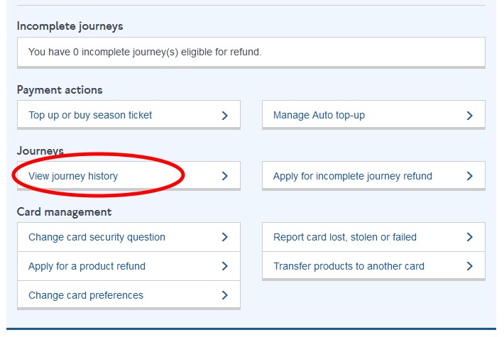
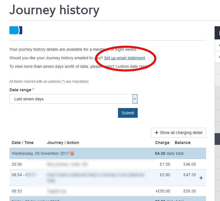
If you register your card with TfL, you can view your journey history (however you can only go back as far as 6 weeks). You can also set up TfL to email you at weekly or monthly intervals with your journeys in csv or pdf format. If you’re someone like me, who loves the idea of collecting data like this, then this is too good an opportunity to pass up.
I recent came across this great post by Jesse Sadler, which is a very good introduction to some network analysis concepts in R.
I have been collecting my own oyster journey history for a while now, but never quite been able to work out what to do with it. The concept of mapping it as a network interested me, but I could never get my ahead around some of the network and graph packages available. Jesse’s post really makes it straightforward, and also shows how to use the tidygraph and ggraph packages to do it in a tidy manner.
After I read it, I also queried (via Twitter) whether you could layout a ggraph geographically, and the package’s creator Thomas Lin Pedersen very helpfully replied which has prompted me to create this post (my first!)
So lets jump in with a random sample of 30 journeys I’ve made.
library(tidyverse)
library(stringr)
library(tidygraph)
library(ggraph)
library(ggmap)
oyster <- read_csv("https://gist.github.com/eldenvo/92d1a6bae98de429a47b6c229e140124/raw/86057c3156e8059f9e7281996deeb71fbfd79fa0/oyster-raw-sample.csv")knitr::kable(head(oyster))| Date | Start.Time | End.Time | Journey.Action | Charge | Credit | Balance | Note |
|---|---|---|---|---|---|---|---|
| 28-Nov-2016 | 20:51:00 | 21:11:00 | Clapham Junction [National Rail] to Denmark Hill [National Rail] | 0 | NA | 4.55 | NA |
| 17-Nov-2016 | 16:59:00 | NA | Bus journey, route 40 | 0 | NA | 10.55 | NA |
| 25-Jul-2017 | 16:58:00 | 17:21:00 | Westminster to Denmark Hill [National Rail] | 0 | NA | 17.95 | NA |
| 26-Nov-2016 | 03:34:00 | NA | Bus journey, route N37 | 0 | NA | 4.55 | NA |
| 12-Sep-2016 | 18:30:00 | NA | Bus journey, route 345 | 0 | NA | 16.45 | NA |
| 09-Jul-2017 | 13:49:00 | 13:58:00 | Denmark Hill [National Rail] to Clapham High Street | 0 | NA | 2.25 | NA |
Now, in terms of mapping a network, there needs to be a start and a finish to each journey, so you can’t do it for buses, and in general we need to do a bit of work to manipulate the data into something we can use.
In this next bit we’re categorising the types of journey depending on the text contained in the Journey.Action column. Although they’re not there in my example extract, the history also records other actions such as when you top-up, buy a travelcard, or enter and exit the same station without making a journey. We’re also formatting the date and time.
oyster <- oyster %>%
  mutate(journey.type = case_when(str_detect(Journey.Action, "Bus journey") ~ "bus",
                                  str_detect(Journey.Action, " to ") ~ "train.tube",
                                  str_detect(Journey.Action, "Season ticket") ~ "top.up",
                                  str_detect(Journey.Action, "Topped-up") ~ "top.up",
                                  str_detect(Journey.Action, "Topped up") ~ "top.up",
                                  str_detect(Journey.Action, "Entered and exited") ~ "other"),
         Date = as.Date(Date, format = "%d-%b-%Y"),
         Start.Time = as.POSIXct(paste(Date, Start.Time), format = "%Y-%m-%d %H:%M"),
         End.Time = as.POSIXct(paste(Date, End.Time), format = "%Y-%m-%d %H:%M"))
We want to split the train or tube journeys into a “to” and a “from” column. Before we do that however, we also have to remove some of the extra text that is included in the Journey History statements, such as “[National Rail]” or “[London Overground/National Rail]” and some other cases that I’ve found. There are also some things that we need to remove or edit (and this will become clearer why in a bit), such as “DLR” or changing “&” to “and”.
The way I’ve had to do this using mutate, str_replace_all seems to be very laborious and I feel like there must be a better way (e.g. to create a vector of all the character strings that I want to remove, and pass them to one line of mutate but I haven’t worked out how - please let me know if you have!)
To split the columns into “from” and “to”, we’re going to use str_split_fixed, which takes a string, in this case the Journey.Action column, takes a pattern to split on - " to " - a number of ‘pieces’ to return, i.e. how many columns we want to split this into (for us, 2) and it will return a matrix with two columns. We want the first column of this to become our “from”, and the second to become “to”.
oyster <- oyster %>%
  mutate(Journey.Action = str_replace_all(Journey.Action, " \\(platforms 9-19\\) \\[National Rail\\]", "")) %>%
  mutate(Journey.Action = str_replace_all(Journey.Action, " \\[National Rail\\]", "")) %>%
  mutate(Journey.Action = str_replace_all(Journey.Action, " \\[London Overground\\]", "")) %>%
  mutate(Journey.Action = str_replace_all(Journey.Action, " \\[London Underground\\]", "")) %>%
  mutate(Journey.Action = str_replace_all(Journey.Action, " \\[London Overground/National Rail\\]", "")) %>%
  mutate(Journey.Action = str_replace_all(Journey.Action, " \\[London Underground / National Rail\\]", "")) %>%
  mutate(Journey.Action = str_replace_all(Journey.Action, " \\(Bakerloo, Circle/District and H&C\\)", "")) %>%
  mutate(Journey.Action = str_replace_all(Journey.Action, " \\(Piccadilly, Victoria lines\\)", "")) %>%
  mutate(Journey.Action = str_replace_all(Journey.Action, " journey\\,", "")) %>%
  mutate(Journey.Action = str_replace_all(Journey.Action, " route", "")) %>%
  mutate(Journey.Action = str_replace_all(Journey.Action, "'", "")) %>%
  mutate(Journey.Action = str_replace_all(Journey.Action, " DLR", "")) %>%
  mutate(Journey.Action = str_replace_all(Journey.Action, "&", "and")) %>%
  mutate(Journey.Action = str_replace_all(Journey.Action, "St Pancras International", "St Pancras")) %>%
  mutate(Journey.Action = str_replace_all(Journey.Action, "Kings Cross", "Kings Cross St. Pancras")) %>%
  mutate(Journey.Action = str_replace_all(Journey.Action, "Sutton Surrey", "Sutton")) %>%
  mutate(from = if_else(journey.type == "train.tube",str_split_fixed(Journey.Action," to ",2)[,1],""),
         to = if_else(journey.type == "train.tube",str_split_fixed(Journey.Action," to ",2)[,2],"")) %>%
  select(2,3,10,11,4:9)

knitr::kable(head(oyster,5))| Start.Time | End.Time | from | to | Journey.Action | Charge | Credit | Balance | Note | journey.type |
|---|---|---|---|---|---|---|---|---|---|
| 2016-11-28 20:51:00 | 2016-11-28 21:11:00 | Clapham Junction | Denmark Hill | Clapham Junction to Denmark Hill | 0 | NA | 4.55 | NA | train.tube |
| 2016-11-17 16:59:00 | NA | Bus 40 | 0 | NA | 10.55 | NA | bus | ||
| 2017-07-25 16:58:00 | 2017-07-25 17:21:00 | Westminster | Denmark Hill | Westminster to Denmark Hill | 0 | NA | 17.95 | NA | train.tube |
| 2016-11-26 03:34:00 | NA | Bus N37 | 0 | NA | 4.55 | NA | bus | ||
| 2016-09-12 18:30:00 | NA | Bus 345 | 0 | NA | 16.45 | NA | bus |
Next we can prepare the data for network analysis. First of all, we’re filtering so we end up with only the train or tube journey. And then we’re filtering out the ones that don’t have a start or end point (because I forgot to tap in or out.) We only want the names of the stations - for our purposes from now on, the other info (times, charges) from the Journey History ins’t relevant, although there’s plenty of other things you could do with that data.
to.remove <- c("[No touch-out]","[No touch-in]","[Unspecified location]")

for.network <- oyster %>%
  filter(journey.type == "train.tube") %>%
  select(from, to) %>%
  filter(!from %in% to.remove,
         !to %in% to.remove)
(Like a Blue Peter presenter, I’m going to now skip ahead and use a file I prepared earlier that’s a bigger random selection of just tube and train journeys - but the file used from now was arrived at using the steps above. At this stage, I’m also loading a csv with all the tube and train stations in London, with their locations, zone, etc.)
for.network <- read_csv("https://gist.github.com/eldenvo/746d430bfffb90440d9c623db1818fa8/raw/2b749befe5887fff7295bfdccff882fe47aa7288/oyster-network-prepared.csv")

stations <- read_csv("https://gist.github.com/eldenvo/91914f027af228036e1c2dc535646a90/raw/c6dd4e33e6a818541a32aada3cda2dbb3ee572b2/stations.csv")
Following the steps again from Jesse Sadler’s post, referenced above, we want to then make a list of all the unique stations I went from, and then a list of all the unique stations I went to, and then join them together, to create our table of nodes (i.e stations) for the network, and also assign them an id. Lastly, we’ll join our list of nodes with the info we’ve imported from the stations.csv - and you’ll understand that this is why we had to tidy up the names of the stations from the raw journey history file, so that they match at this point.
sources <- for.network %>%
  distinct(from) %>%
  rename(label = from)

destinations <- for.network %>%
  distinct(to) %>%
  rename(label = to)

nodes <- full_join(sources, destinations, by = "label")


nodes <- nodes %>%
  mutate(id = row_number())

nodes <- nodes %>%
  left_join(stations, by = c("label" = "Station")) %>%
  select(id, label, x = Longitude, y = Latitude, zone = Zone, postcode = Postcode)

knitr::kable(head(nodes,5))| id | label | x | y | zone | postcode |
|---|---|---|---|---|---|
| 1 | Peckham Rye | -0.0699836 | 51.46951 | 2 | SE15 5DQ |
| 2 | East Croydon | -0.0918635 | 51.37572 | 5 | CR0 1LF |
| 3 | Old Street | -0.0876230 | 51.52558 | 1 | EC1V 9NR |
| 4 | West Croydon | -0.1020343 | 51.37855 | 5 | CR0 2TA |
| 5 | Forest Hill | -0.0533285 | 51.43931 | 3 | SE23 3HD |
Then we want to create the edges, which is the list of the journeys made. Essentially, this is to identify all the unique journeys made, and how many times they have been made (their weight), using group_by and summarise.
edges <- for.network %>%
  group_by(from, to) %>%
  summarise(weight = n()) %>%
  ungroup() %>%
  arrange(-weight)

head(edges,5)
## # A tibble: 5 x 3
## from to weight
## <chr> <chr> <int>
## 1 West Croydon Forest Hill 9
## 2 East Croydon Clapham Junction 2
## 3 Westminster Denmark Hill 2
## 4 Blackfriars Westminster 1
## 5 Clapham Junction Denmark Hill 1Finally, join this table with the nodes, in order to just get a list of the source and destination id, and the weight.
edges <- edges %>%
  left_join(nodes[,c(1,2)], by = c("from" = "label")) %>%
  rename(from.id = id)

edges <- edges %>%
  left_join(nodes[,c(1,2)], by = c("to" = "label")) %>%
  select(from.id, to.id = id, weight)

head(edges,5)
## # A tibble: 5 x 3
## from.id to.id weight
## <int> <int> <int>
## 1 4 5 9
## 2 2 6 2
## 3 8 7 2
## 4 9 8 1
## 5 6 7 1And now, we’re ready to use tidygraph to turn this into a network! And now we have our edges and nodes neatly sorted out, it’s very simple to create a tbl_graphthat can be analysed and used further in ggraph.
routes <- tbl_graph(nodes = nodes, edges = edges, directed = TRUE)

print(routes)
## # A tbl_graph: 22 nodes and 20 edges
## #
## # A directed simple graph with 5 components
## #
## # Node Data: 22 x 6 (active)
## id label x y zone postcode
## <int> <chr> <dbl> <dbl> <int> <chr>
## 1 1 Peckham Rye -0.06998355 51.46951 2 SE15 5DQ
## 2 2 East Croydon -0.09186350 51.37572 5 CR0 1LF
## 3 3 Old Street -0.08762296 51.52558 1 EC1V 9NR
## 4 4 West Croydon -0.10203429 51.37855 5 CR0 2TA
## 5 5 Forest Hill -0.05332850 51.43931 3 SE23 3HD
## 6 6 Clapham Junction -0.17031500 51.46437 2 SW11 2QP
## # ... with 16 more rows
## #
## # Edge Data: 20 x 3
## from to weight
## <int> <int> <int>
## 1 4 5 9
## 2 2 6 2
## 3 8 7 2
## # ... with 17 more rowsWith that, we have enough data to produce a simple network graph, that is also geographically accurate! Using layout = 'nicely' in ggraph will automatically pull the x and y coordinates of the stations from the edges frame. ggraph follows the grammar of ggplot2 and adds geoms to represent the nodes and edges.
ggraph(routes, layout = "nicely") +
geom_node_point() +
geom_edge_link() +
theme_graph()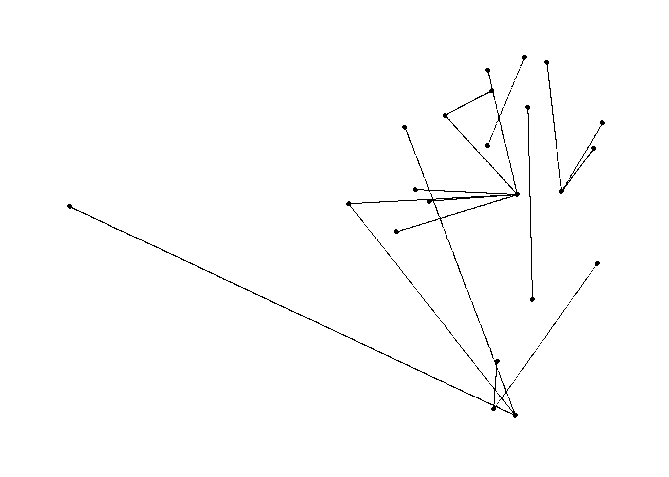 Well - that’s something!
We can make that a bit more comprehensible by providing some further details, and there’s plenty more information in the vignettes for ggraph (the stuff below for the edges comes from this page):
- Rather than showing the nodes as points, I’ll put them as labels with
geom_node_label- and we will give them a colour based on the zone of the station
- Rather than
geom_edge_linkI’ll usegeom_edge_fanso that journeys along the same route but in the opposite direction no longer overlap- we will also add arrows to make the direction clear, and then use the
start_capandend_capto include a bit of space between the arrows and the labels
- we will also add arrows to make the direction clear, and then use the
- The thickness and the transparency of the edges is determined by the weigh (i.e how frequently each journey is made)
- but because there can be quite a large discrepancy between the weights (e.g some journeys could be made every day, others a one off), we want to define a range to the
scale_edge_alphaandscale_edge_widthso they’re not too drastic
- but because there can be quite a large discrepancy between the weights (e.g some journeys could be made every day, others a one off), we want to define a range to the
ggraph(routes, layout = "nicely") +
geom_node_label(aes(label = label, fill = as.factor(zone)),
size = 1.75, show.legend = F,label.padding = unit(0.15, "lines")) +
geom_edge_fan(aes(start_cap = label_rect(node1.label),
end_cap = label_rect(node2.label),
width = weight, alpha = weight),
arrow = arrow(length = unit(2.25, 'mm'), angle = 20), show.legend = F) +
scale_edge_width(range = c(0.5, 3)) +
scale_edge_alpha(range = c(0.5,0.75)) +
theme_graph()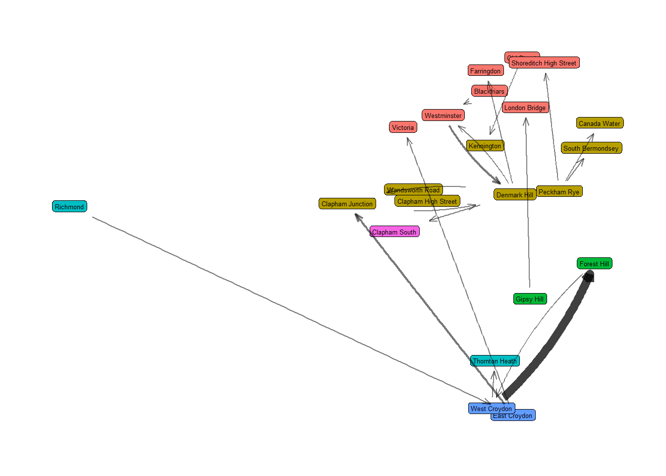 That’s much better! There’s some overlapping and lack of clarity, but that could all be tidied up for a final output. We can now make a bit more sense of the network, the stations, which journeys are more frequent.
For my next trick, I will plot this on a map using ggmap - as mentioned by Thomas Lin Pedersen in the tweet I linked above, and also described in this RPubs post, which is very helpful if not altogether easy to follow..
I want to find the limits of my network, and slightly expand them, to ensure everything fits on our eventual map, and set these as a vector anti-clockwise from the left. From these, we’ll make a nice watercolor map of London from get_stamenmap.
x.range <- (max(nodes$x) - min(nodes$x))/20
y.range <- (max(nodes$y) - min(nodes$y))/20
coords <- c(left = min(nodes$x)-x.range, bottom = min(nodes$y)-y.range, right = max(nodes$x)+x.range, top = max(nodes$y)+y.range)
map <- get_stamenmap(coords, zoom = 12, maptype = "watercolor")
ggmap(map)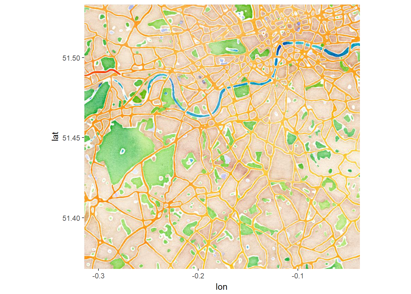 Pretty, no? Now we have our base map, it’s easy to plot our network on top of it, following the steps indicated in the RPubs post.
We need to pass our first ggraph() call to the base_layer= argument of ggmap, and then add the rest of our ggraph geoms.
gg <- ggraph(routes, layout = "nicely")
ggmap(map, base_layer = gg) +
geom_node_label(aes(label = label, fill = as.factor(zone)),
size = 1.75, show.legend = F,label.padding = unit(0.15, "lines")) +
geom_edge_fan(aes(start_cap = label_rect(node1.label),
end_cap = label_rect(node2.label),
width = weight, alpha = weight),
arrow = arrow(length = unit(2.25, 'mm'), angle = 20), show.legend = F) +
scale_edge_width(range = c(0.5, 3)) +
scale_edge_alpha(range = c(0.5,0.75)) +
theme_graph()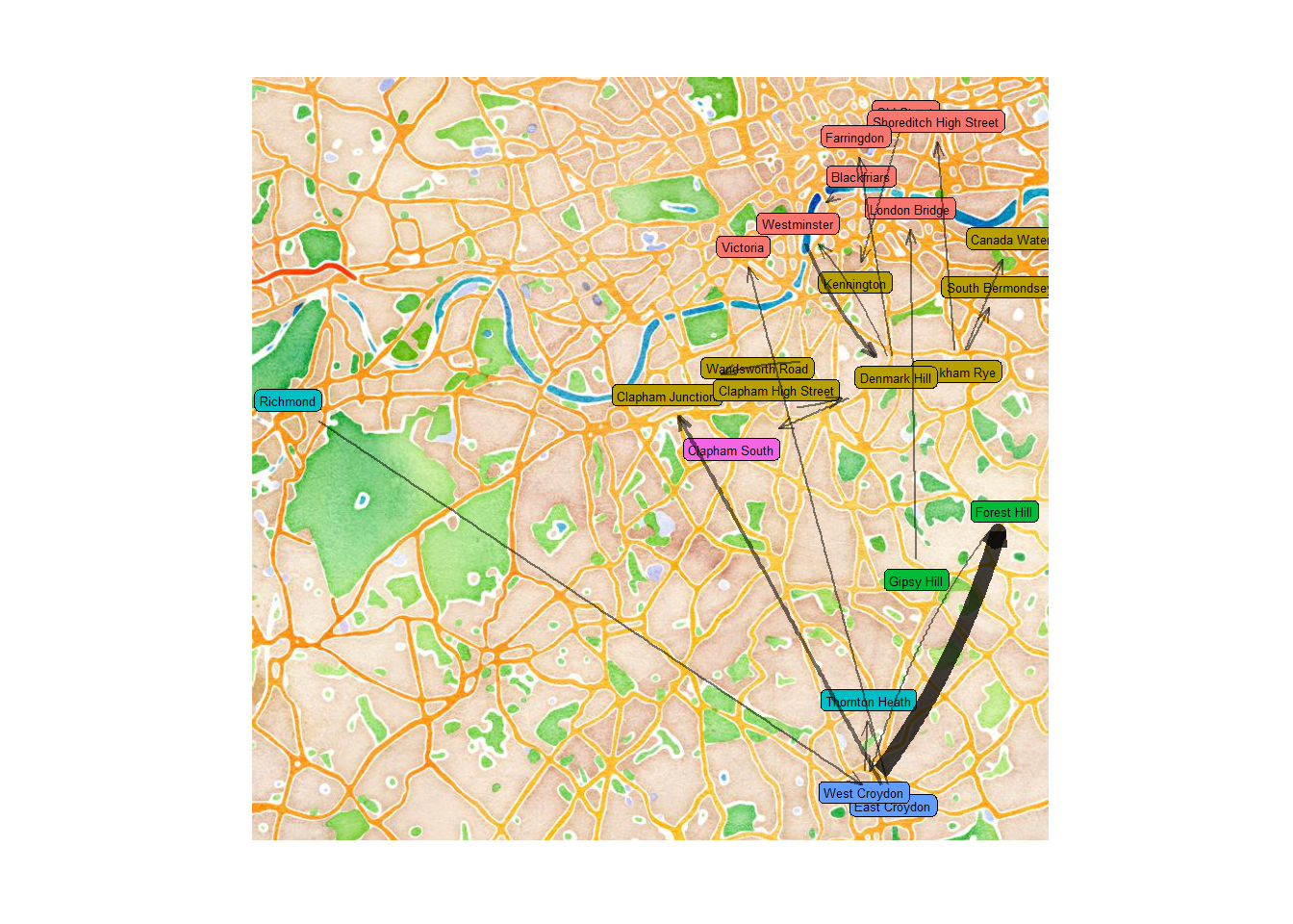 Et voila! There we have it. I’ll save it at a higher quality with
 ggsave("oyster-map-1.png", width = 9, height = 9, dpi = 300, type = "cairo-png") 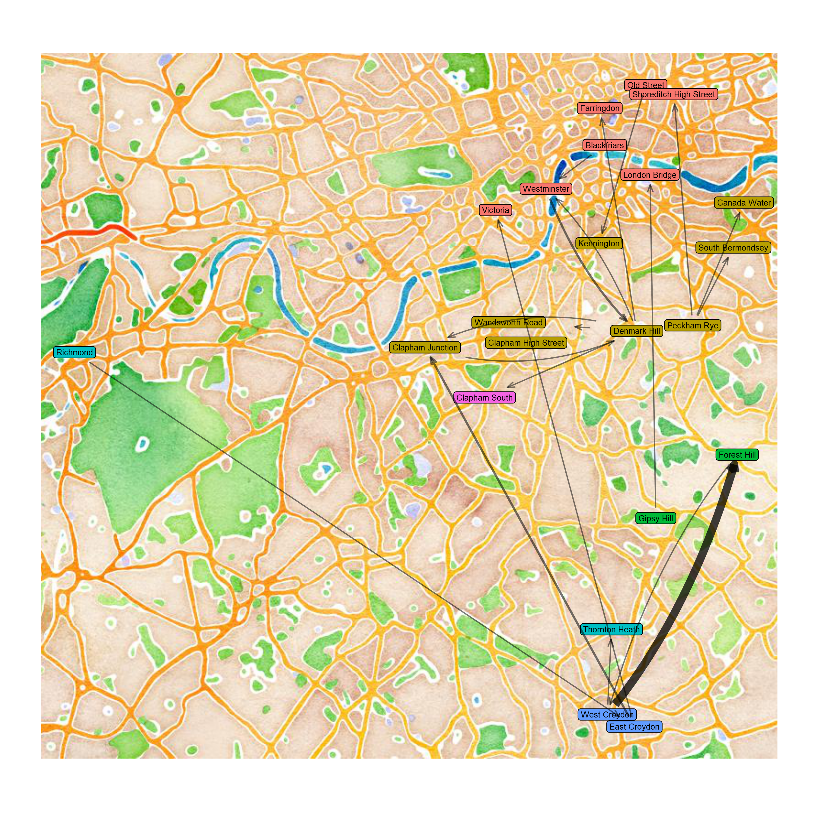 So there we have it - actually plotting the map was really not that complicated at all, most of the work is just wrangling the data into the right format. With bigger numbers of journeys (I have about 500 recorded…), the maps becomes quite busy - but you can play around with the geoms and other arguments to make it work.
Things I’d be interested in doing with this (but don’t know how) would be:
Rather than a geographically accurate map, could you plot the nodes to match the stations’ locations on the tube map? You’d just need to pass a different set of coordinates, but how would you get them?
As I understand, you can facet in
ggraph, but I don’t know how you could do that here to show a month-by-month sequence of small multiplesIn addition to that, could you use
gganimateto show each journey stacking up on eachother over time?
Any thoughts or ideas on this, or any other tips for me based on this post, just send me a tweet or leave a comment on github. I’m new to this and I’d welcome any feedback!